| Artist's Notes
THE FIRST time I tried digital painting back in 1992, I knew I was never going back.
I realized immediately that digital paint programs were as much an advance for artists as word processors were for writers.
For the first time, I could apply every type of traditional paint with a single stylus, and switch between them with the touch of a button.
It wasn't just that digital media recreated the effects of traditional artistic materials so marvelously, it was that the new digital media was actually far superior.
Even on an arthritic early '90s PC, it was already possible to isolate individual elements of a painting on separate, discrete layers, and combine totally different types of paint -- say oil with watercolor -- together in the same painting.
In fact, you could draw oil paint and watercolor together and blend them as if they were pastel, and then come in over the top with colored pencil highlights, if you wanted. Please don't try that at home with your traditional oil, watercolor and dry media, Michelangelo.
FROM THE OUTSET, I have tried for the same effects in digital painting that I tried for in traditional painting.
I do not want people to look at one of my paintings and think "that was made on a computer." I want them to react to image, and think "I like that painting" or "that painting bores me."
Often I try to evoke specific moments -- the light and the space -- with painterly color and line that amplifies their larger archetypal implications. I think the best paintings are also poems. Georgia O'Keefe, Morris Graves, Maynard Dixon, Emily Carr, Richard Diebencorn, Susan Benestrom and Hokusai are among my gods.
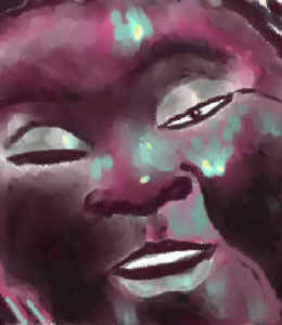
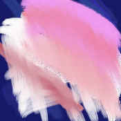
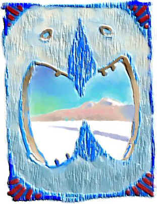
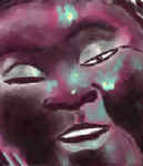
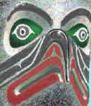
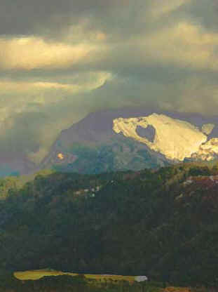
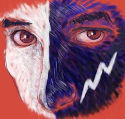
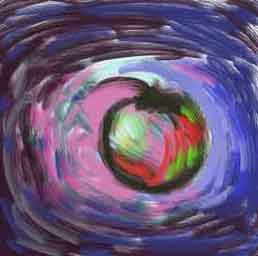
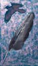
Over the years, though, the digital tool has affected the way I paint. You can see this progression in the first three images in this collection, all of which are from the Mask Series I produced in the winter of 1993-4, beginning with One-Eyed Buddha, which I painted for my friend George Arthur when he was dying of AIDS.
One-Eyed Buddha is pretty much a traditional pastel in every way, except for the fact that I never touched a pastel: it was all done in Fauve Matisse on a Windows 3 PC with a pressure sensitive Kurta tablet. The second, Deep Cove Hawk, begins to leave the traditional path with a sort of cross between pastel and oil in the pointillistic surface textures.
Finally, the last image, Death In The Far North, combines traditional pastel techniques (for the sunny mountains in the distance) with the kind of bas relief textural effects that are only available to the digital painter (for the fierce wooden mask that frames the distant scene of a single track that leads away and doesn't come back).
By the late '90s I was using Photoshop's Artistic Filters to quickly render and rough photos into unfinished paintings. Then I'd go in and finish them by painting in selective detail, highlights, etc. It was like having the sort of workshop of apprentices that many Renaissance masters employed. My homage to Edward Hopper, The Edge of Town, Bluffs and The Summer Before The War are examples from this period.
THEN IN 2002, partly in response to a comment by Wade Marlow at the Blue Horse Gallery in Bellingham, WA, I returned to freehand painting in Painter and the close-crop mask portrait, which I had used in the earliest digital paintings displayed above.
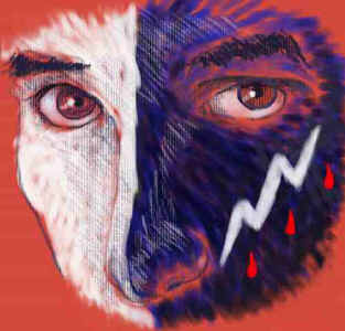
To me, the comparison of the early One-Eyed Buddha and the recent Crazy Horse is particularly satisfying. Not only is my technique and command much more refined in Crazy Horse, but Crazy Horse is a more audacious undertaking.
While One-Eyed Buddha is essentially about opaque surfaces of fate, literally and figuratively, Crazy Horse is about penetrating clarity. When I set out to paint Crazy Horse (the greatest American historical figure for whom we have no image from life), I wanted to capture both his fierce animalism and his detached intelligence.
So I focused in on just his eyes and his war paint, which we know from historical record featured a thunderbolt and a rain of blood on the black side of his half black, half white face. It would have been easy to give Crazy Horse a fierce look, but I didn't want to do that.
I wanted more complexity, so I strove for the appearance of a person who looks to really see -- direct, open and a little scary in its utter lack of the modern cultural affectations we put so much stock by. And yes, I'm working on a book on Crazy Horse, but that's another story for another time...
I GENERALLY output my paintings to high quality color ink jet printers in various sizes ranging from 4 x 5 inches to 13 x 19 inches.
Sometimes, though, I paint for display on the computer screen -- essentially large, high quality versions of what you see on your screen here.
I think of the pieces I paint for the computer screen as examples of the "The New Stained Glass," to coin a phrase. Projected and reflected light simply have different qualities and different possibilities, and I like to be able to chose between them as the image dictates.
At some point (in the not too distant future) I hope to have a show of some of these images in a traditional gallery, with PCs running flat panel screens that are hung on the wall like canvases, each displaying a different digital painting or animated image loop of mine, as well as traditional framed prints.
Which brings us to the awkward question -- what kind of art is this? I personally don't think it matters. What matters is the images. If some of the images are strong enough to really touch people, then the art works, no matter what you call it.
Certainly, a hundred years from now these questions will all be moot, because by then digital painting will have become the primary way most artists create.
-- Bruce Brown
January 15, 2003
|